WLW
When Love Works
A redesign for a site
that helps you redesign yourself.
About This Product...
‘When Love Works’ is a website that offers individuals the tools and resources they need to maintain a healthy mindset and to deal with any internal issues they may be struggling with.
I worked on the WLW website, redesigning the site to be more responsive to the user's behavior and environment based on screen size, platform, and orientation.
The target audience is individuals that find themselves not knowing how to resolve their internal issues that may be negatively affecting their relationships with others.
My team strived to increase findability and ease-of-use for users. To accomplish this, we needed to find out what users would want out of a site like WLW.
My Role:
Product strategy
User Research & Heuristic Analysis
Information Architecture
Persona Creation
Wireframing & Prototyping
UI Design
Trust The Process...
Discovery & Planning
Heuristics
An early site audit revealed the existing WLW website had some serious issues that could negatively affect the user experience. Here are some questions that were asked during this process:
Is it clear? Is it easy to understand
Is it findable? Can users easily locate what they're looking for?
Is it communicative? Does the navigation and messaging help establish a sense of place
Is it useful? Are users able to complete tasks that they set out to without major frustration or blockers?
Is it valuable? Is it desirable to the target user?
Is it delightful? How are user expectations not just met but exceeded?
Contextual Inquiry
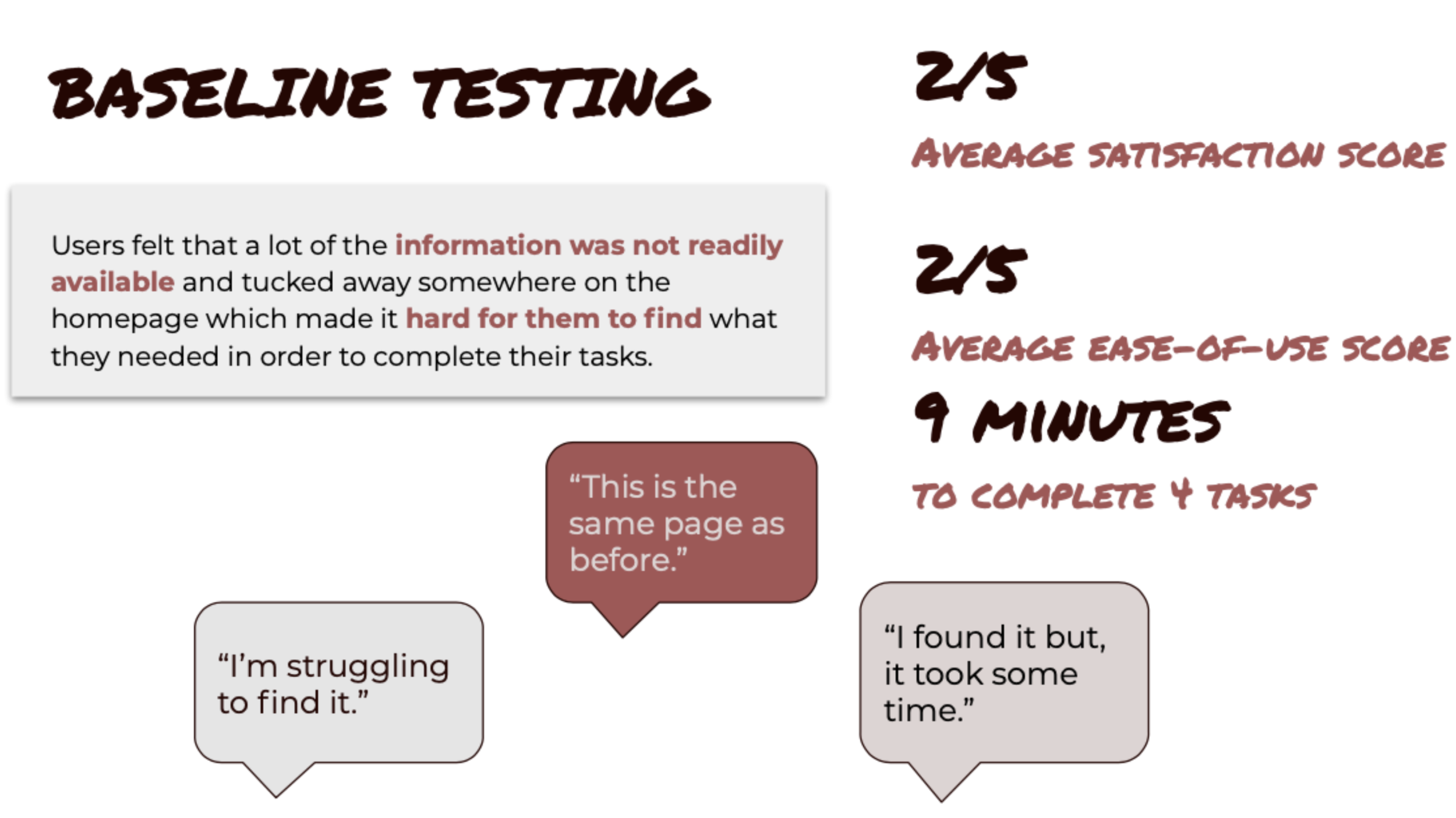
This is where we confirm or falsify the assumptions made during our site audit. We let suitable users give us their opinion of the site after using the site to complete a set of tasks.
5
Usability Tests
4
Tasks
9 Mins
Average Time on Task
Interviews
We interviewed 6 users to get a sense of what they needed and wanted from a site like WLW.
Guiding Questions:
What websites or apps do you use or have you used in the past for personal growth, relationship, life-coachingservices?
Which WLW services and/or products have you used in the past?
How did you first learn about When Love Works and their services?
What were you looking to gain from your experience?
What were your main likes and dislikes when it comes to seeking help?
What features, if any, do you or would you find helpful in an app geared towards these kinds of coaching services?
Insights
Users are ready to commit their time and invest money in services that directly pertain to their personal situation, but they need to be presented with the information & details in a way that is easy to find & understand.
Users want to know that other people in similar situations were successful before they decide to use the services.
Our users need a comfortable, supportive, and transparent community that will keep them accountable in their growth.
Users are motivated to put skills learned in coaching directly to use, and in future endeavors.
Users have some self-awareness but struggle with knowing how to help themselves.
Users enjoy listening to the WLW Podcast because it provides content that is relevant to their lives, and keeps them connected and engaged with the WLW community.
Users want to be able to attend events that help them stay connected with supportive communities and find other opportunities for growth.
Even in a tech-saturated world, users want as much direct human connection as they can get.
Meet Kai!
Based on the information gathered; the insights found during user interviews and affinity mapping, we were able to create a persona. This persona would prevent us from straying away from the needs of the user during developmental stages.
We referred to them throughout the entire product development process as, Kai.
This persona was a valuable tool to convey the thoughts and concerns of the users to the stakeholders, while also promoting empathy.
Let's See What The Competition Is Up To...
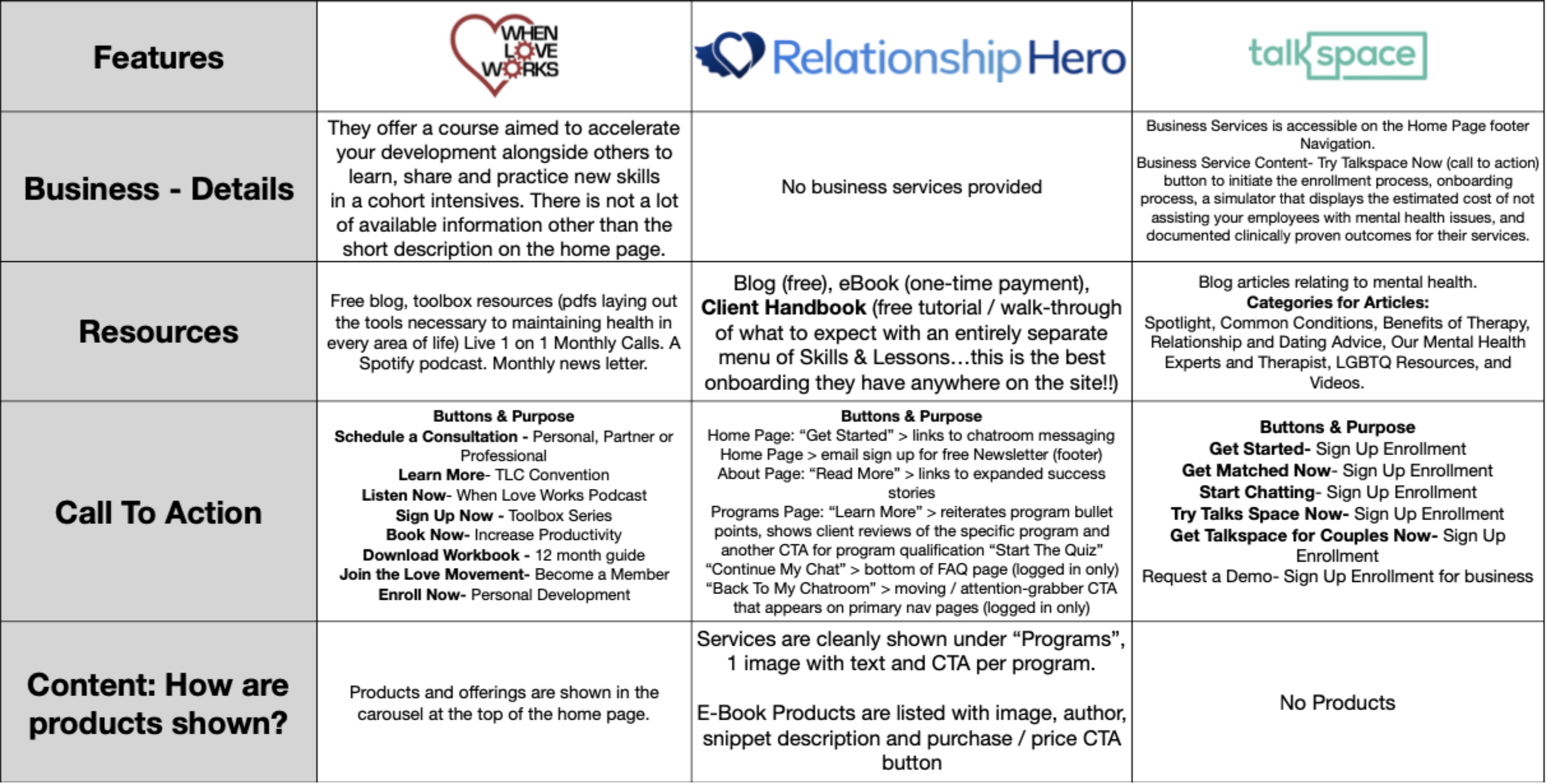
In order to learn about trends in the competitive space, we compared our product to similar products.
This allowed us to find out what features may be missing from our product and what features may not be needed.
Here's our Competitive Analysis!
But you're not going to read it... So read this!
We looked for other services that offered life coaching and/or therapy and compared features. Here are the major takeaways:
Call to Action
Unlike competitors, the existing site doesn't have a clear call to action on the homepage.
Onboarding
Competitors strive to explain their process in order to keep potential users informed.
Footer Navigation
The existing site has no footer navigation. Both competitors include a footer navigations to give the user direction and a sense of place.
How did this help us moving forward?
We realized that all these features mattered to users. A clear call to action gives users the guidance they need when they land on the website. The onboarding process keeps users informed and helps them avoid confusion. Lastly, the footer navigation increases the ease of use. With footer navigation, the user is less likely to get lost, no matter where they are on any given page.
It was obviously apparent that these features should be paramount in our design.
Design Studio
Now that my team had a persona to design for, we started just that.
Lo-Fi Wireframe
The team did 3 rounds of studio design before agreeing on our paper prototype. We made this paper prototype so that we could test the design idea quicker and more efficiently.
Mid-Fi Wireframes
We worked diligently on coming up with our Mid-Fi wireframes that addressed all of the concerns and the pain points our users addressed during interviewing and paper prototype testing.
Ideate, Ideate & Ideate some more!
We added a 'How It Works' tab in the primary navigation to address skeptical or confuse users. We also added the programs provided by the coaches on the homepage as we learned most users are eager to find the skills that they can Implement into their everyday life.
Additionally, the podcast was moved from the hero image carousel to the homepage to increase findability.
UI Design
Hi-Fi Design
After moving the “How It Works” tab to the front of the navigation to increase findability, rewording confusing language so that the user can know what the website is offering and repositioning content to give the page room to breathe... We came up with this!
Hi-Fi Mockup Results
Why We Synthesis Data...
By using the data obtained during Mid-Fi user testing, we were able to create a Hi-Fi mockup that addressed even more user pain points than during Mid-Fi testing.
Users were able to easily complete tasks in a fraction of the time it took them to complete before.
8
Iterations
83%
Increase in ease-of-use
15
Hi-Fi Screens
5/5
Average Satisfaction Score
We saw a lot of success with the Hi-Fi prototype. However, the work never ends...
Next Steps
Create new registration & payment portals for services
Integrate "My Account" login for returning users
Review naming conventions for services to include all pronouns ("His/Hers", & "Toolbox")
Develop & Strategize additional content for website
Research the market for Professional Development opportunities


